One session at a time.
Eleos is a healthcare delivery startup that is significantly improving behavioural therapy. I created its full branding, from the new logo to the finishing touches of its brand book.
The total package, made with love.
I was called for the “total package”: a full branding, from a new logo to a fresh visual language, marketing materials and a trendy new website, which I created with a lot of love and passion.
- New logo
- Visual language
- Marketing materials
- Website
- Icons
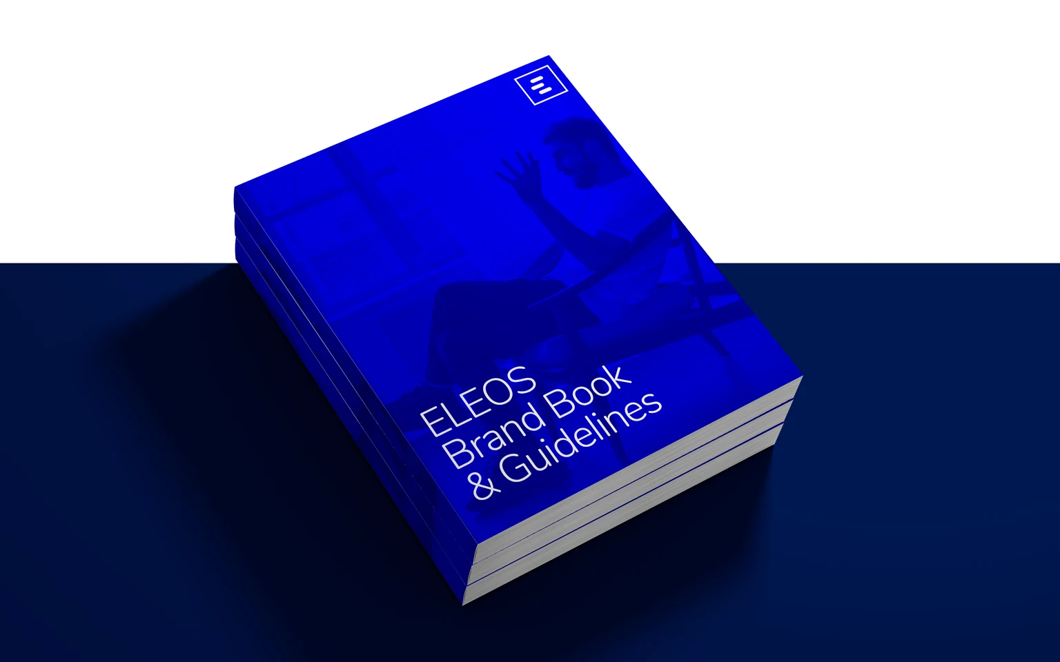
- Brand book
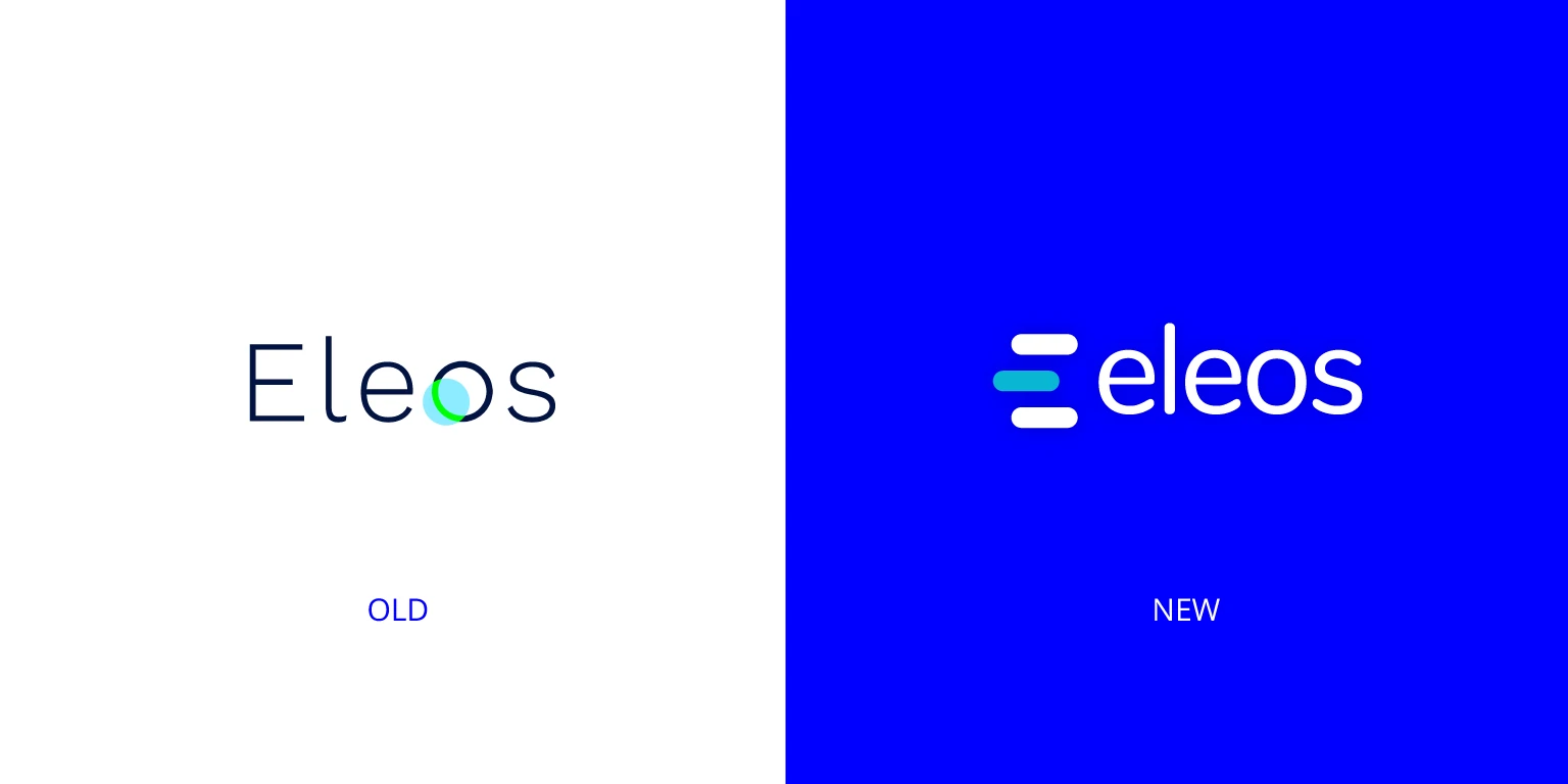
From a light wordmark to a confident mark.
Everyone gets the care they deserve.
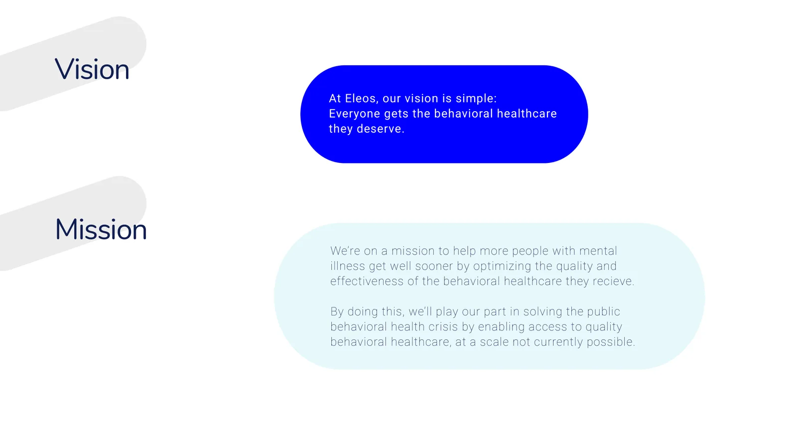
At Eleos, our vision is simple: everyone gets the behavioral healthcare they deserve.
We’re on a mission to help more people with mental illness get well sooner by optimizing the quality and effectiveness of the behavioral healthcare they receive.
By doing this, we’ll play our part in solving the public behavioral health crisis by enabling access to quality behavioral healthcare, at a scale not currently possible.
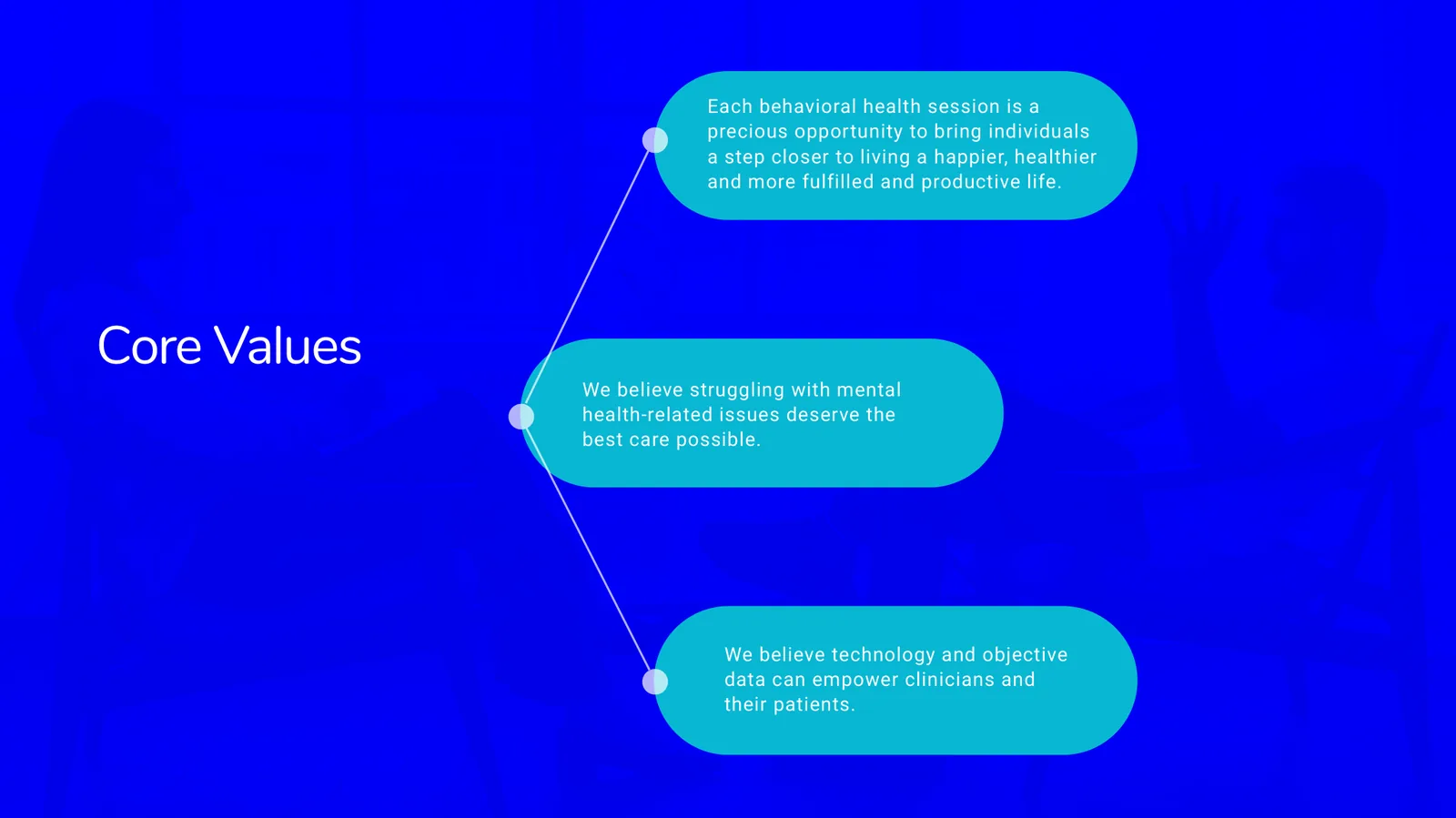
Core values
- Each behavioral health session is a precious opportunity to bring individuals a step closer to living a happier, healthier and more fulfilled and productive life.
- We believe struggling with mental health-related issues deserve the best care possible.
- We believe technology and objective data can empower clinicians and their patients.
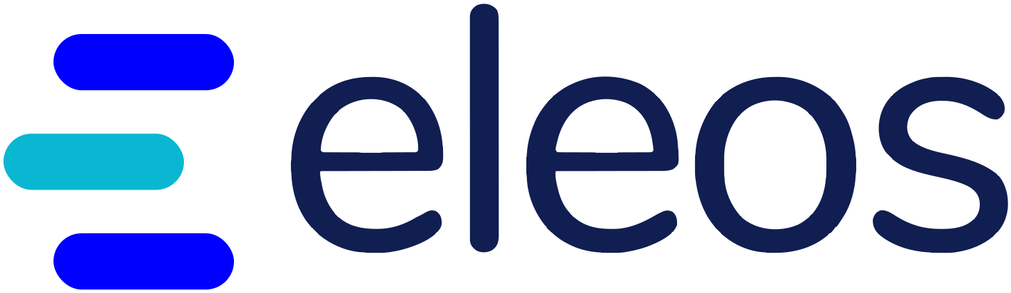
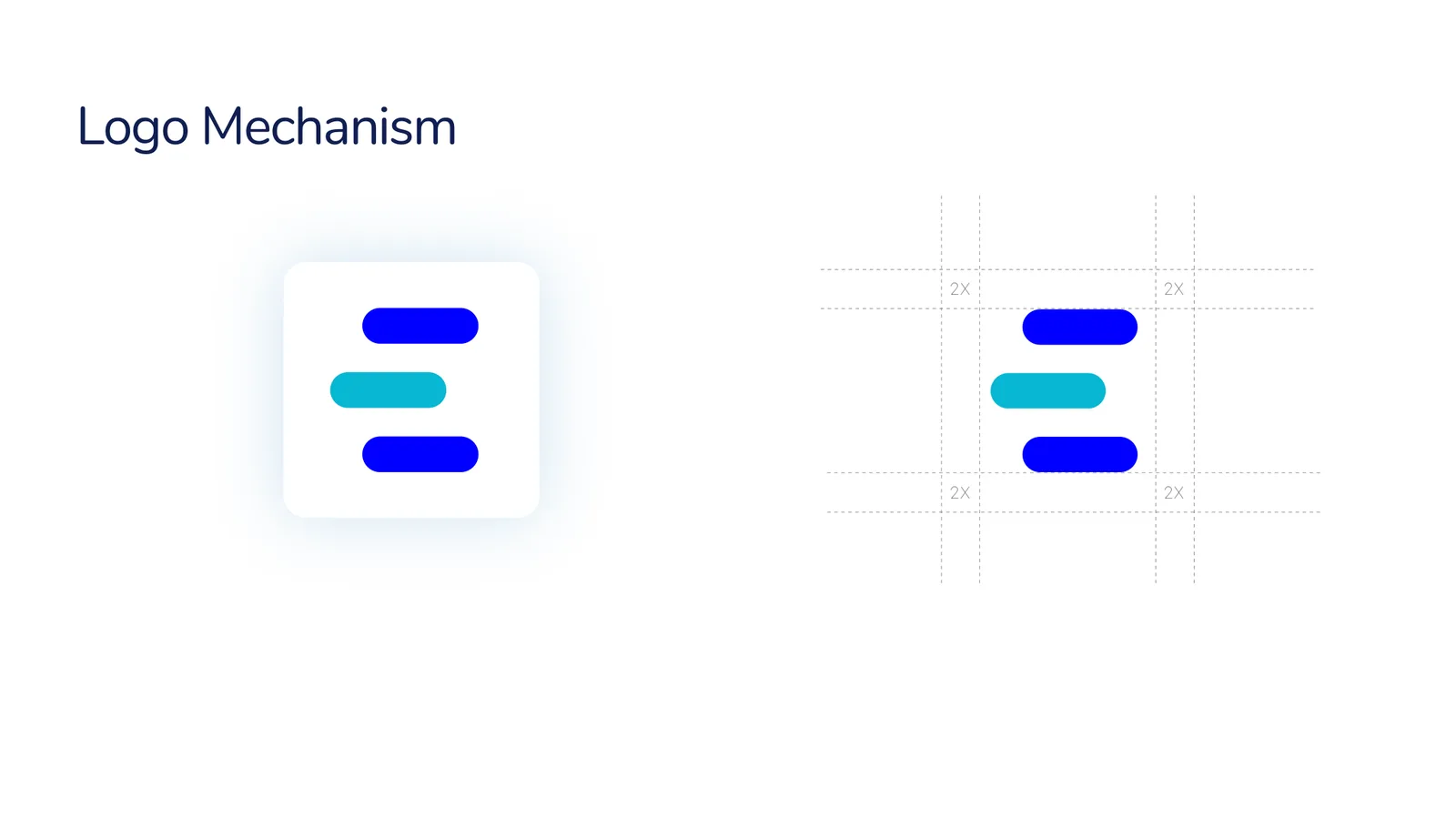
Three rounded bars build the letter E.
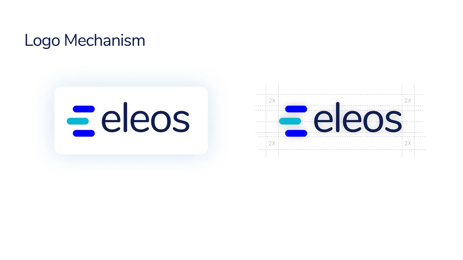
The logo represents the letter E, timeline and conversation elements from the Eleos product, and visualizes progress and motion. The middle bar steps to the left, and the symbol sits on a two-unit modular grid.

One logo, always consistent.
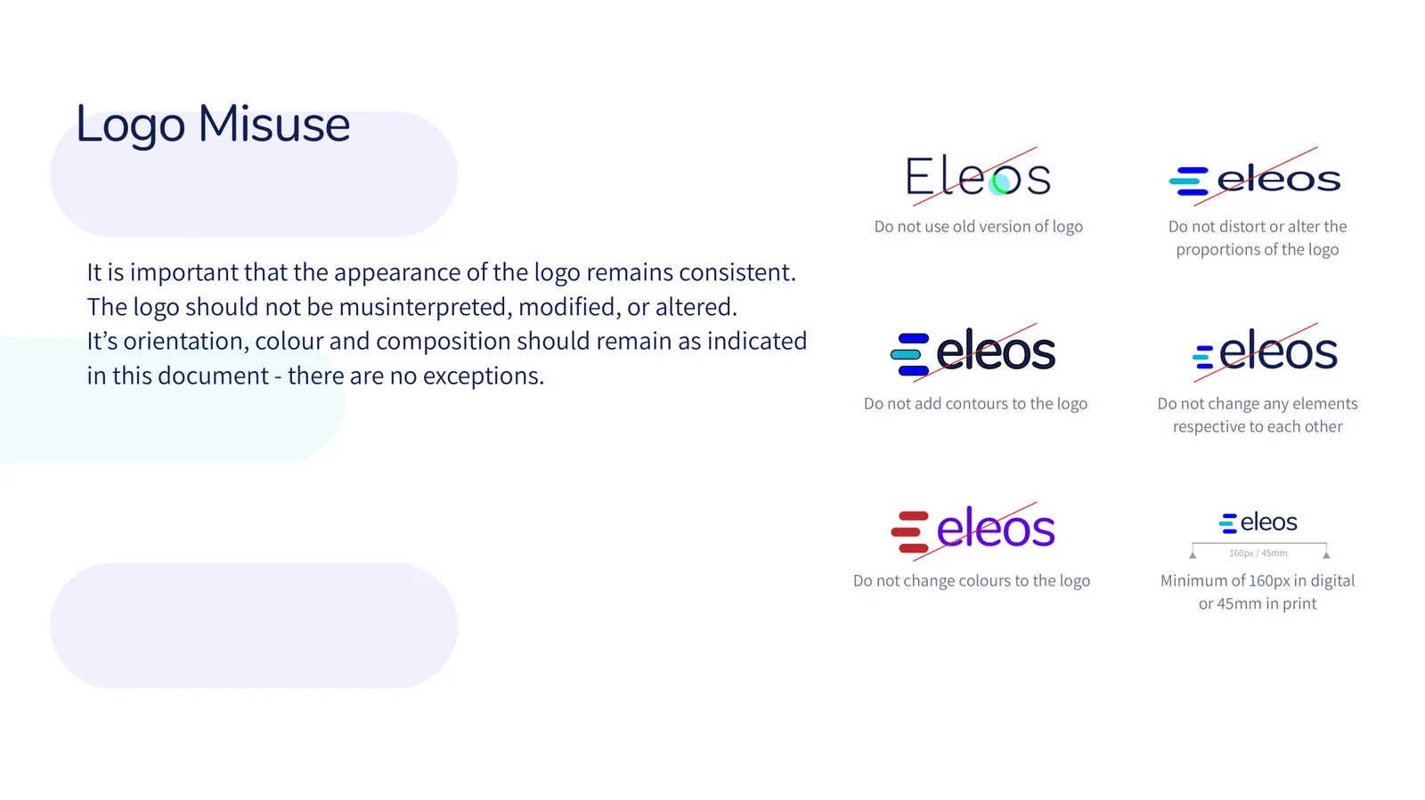
The logo should not be misinterpreted, modified or altered. Its orientation, colour and composition stay exactly as defined, with no exceptions.
- Never use the old version of the logo
- Never distort the proportions or change elements relative to each other
- Never add contours or change its colours
- Minimum size: 160px in digital, 45mm in print
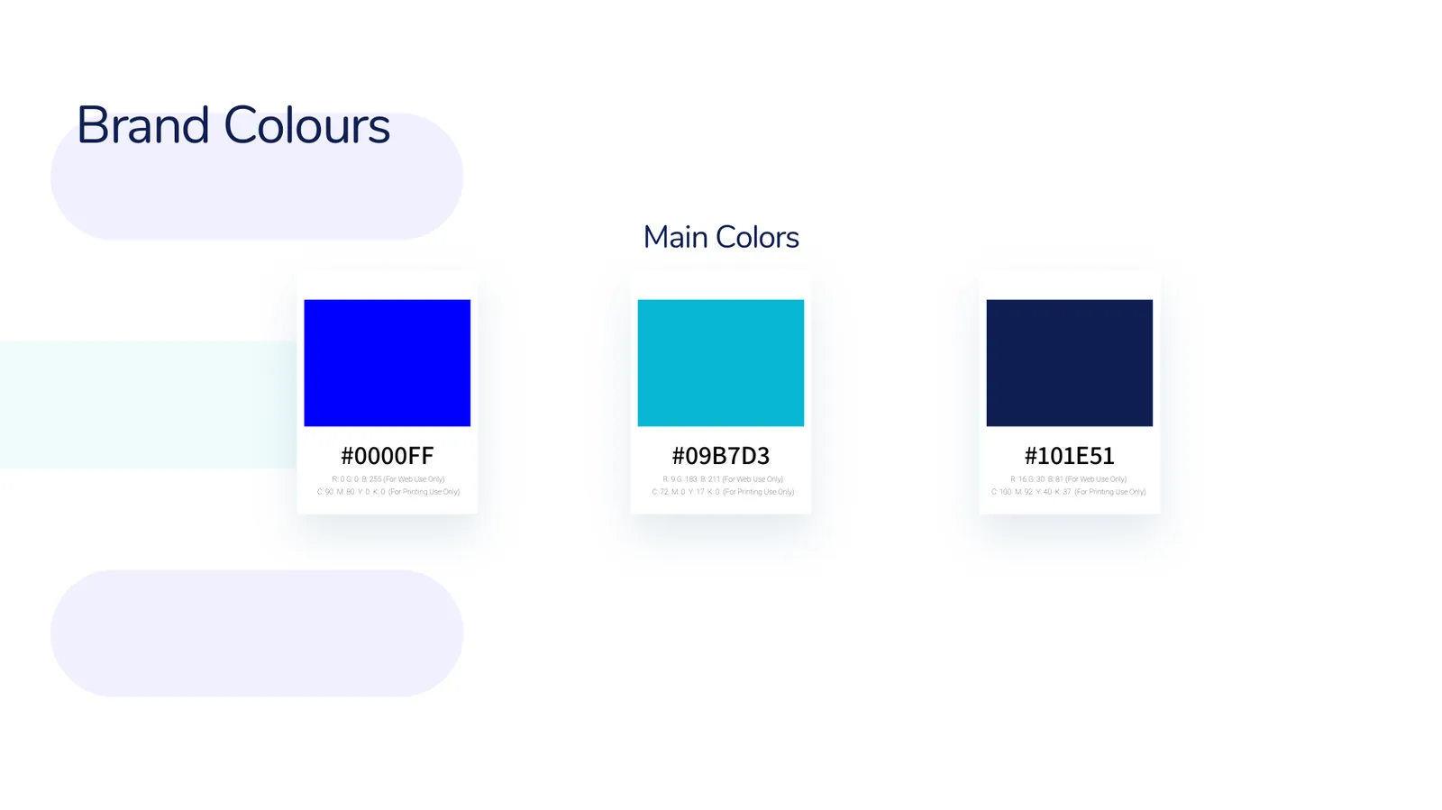
Blue, cyan and night navy, set in Nunito.
Click a colour to copy its hex.
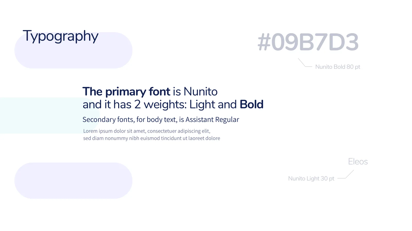
Primary font · Nunito, Light and Bold
Nunito Light
Nunito Bold
Secondary font, for body text · Assistant Regular
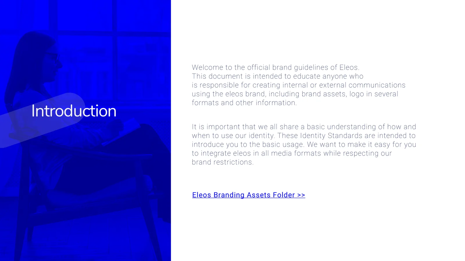
The welcome to the official brand guidelines of Eleos is intended to educate anyone responsible for creating internal or external communications with the Eleos brand, so every sentence reads clearly and calmly.
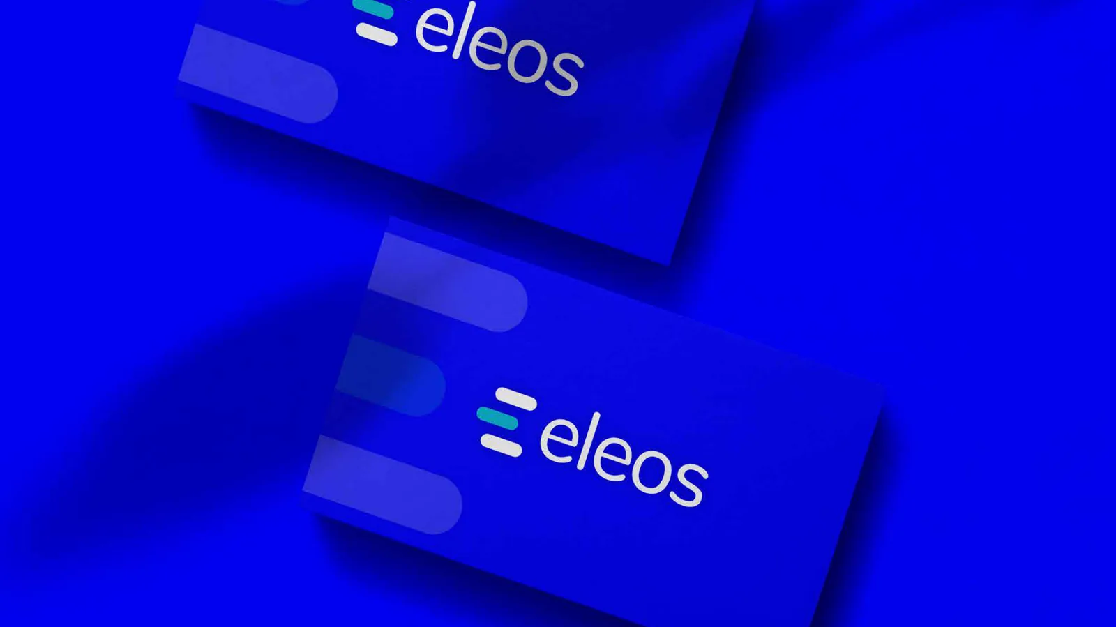
On cards, walls, phones and paper.
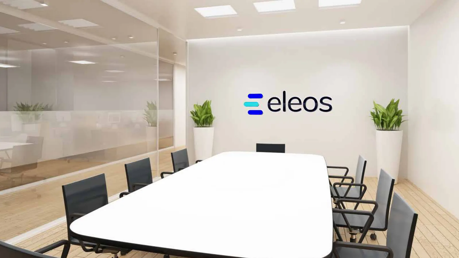
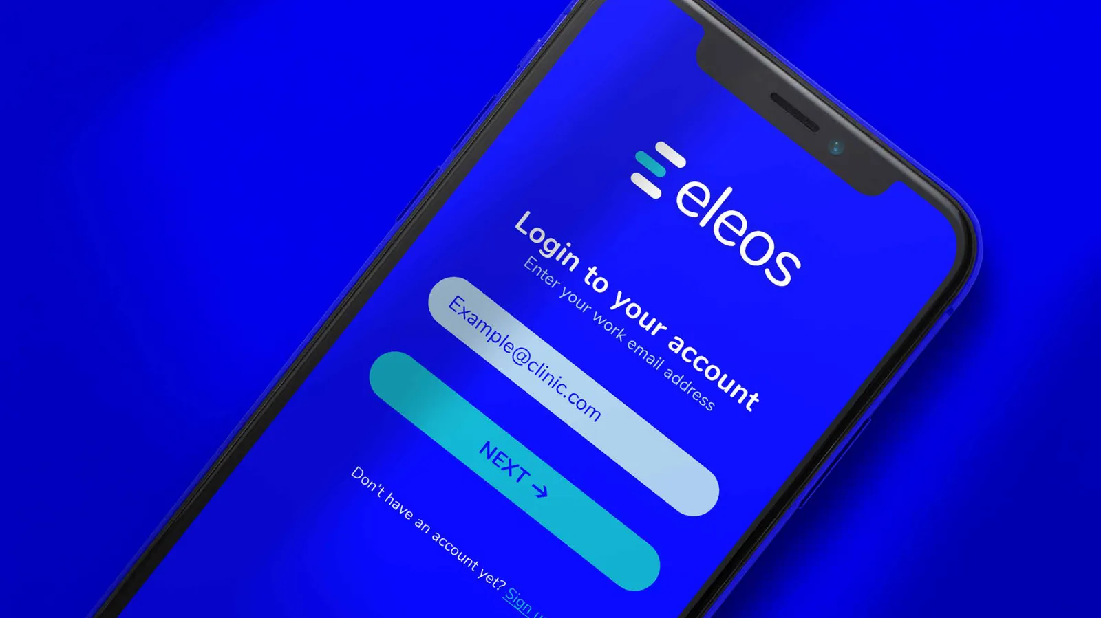
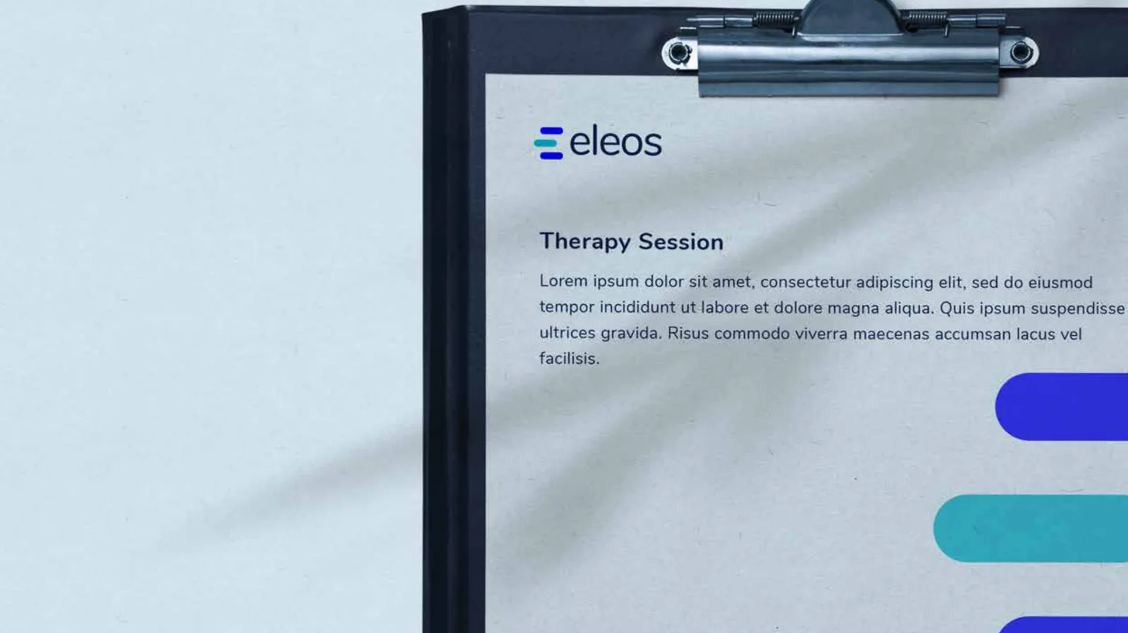
Behavioral healthcare delivery, supercharged.
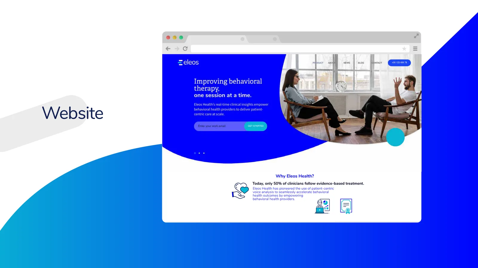
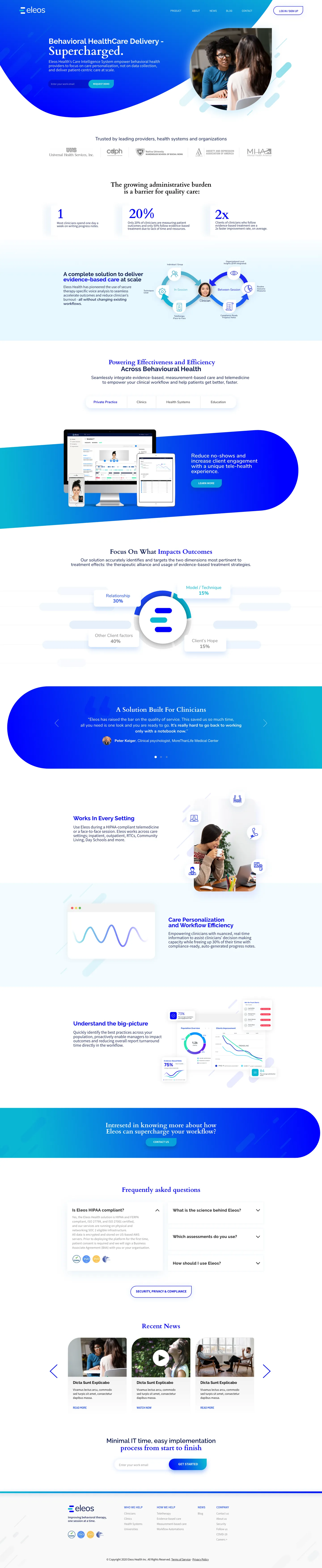
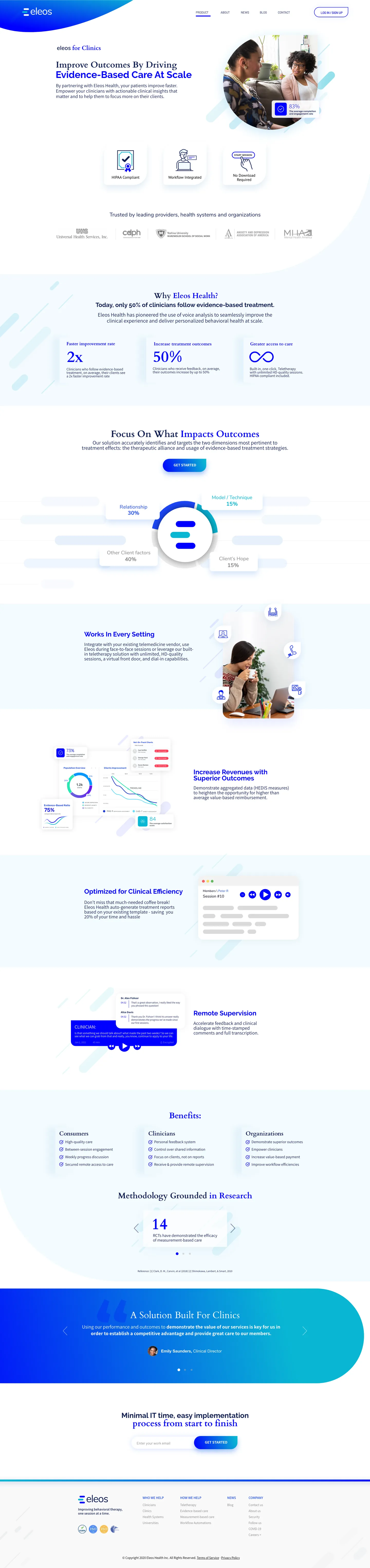
The website design follows the brand: a curved electric-blue header, round photography and bars that echo the logo. Scroll through the full designs below.
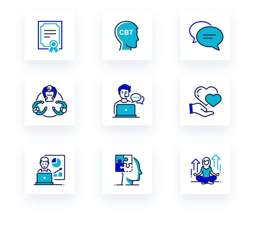
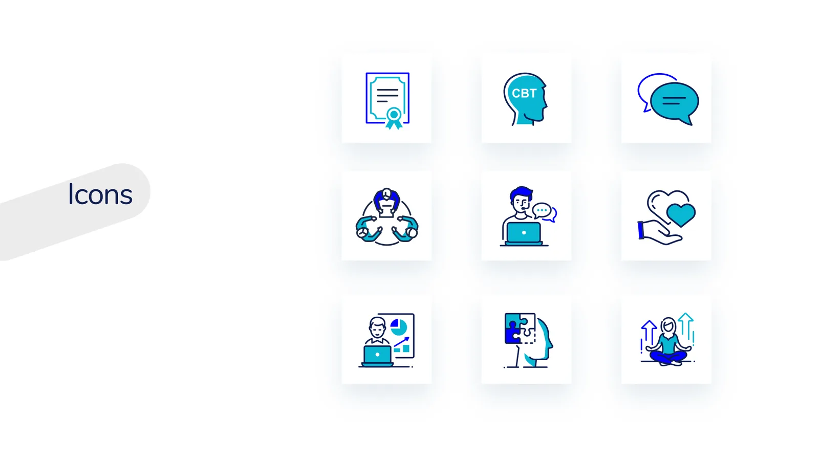
A set of friendly line icons.
Nine duotone icons in the brand colours, from certificates and CBT to conversation, care and growth, made to sit comfortably next to the logo.
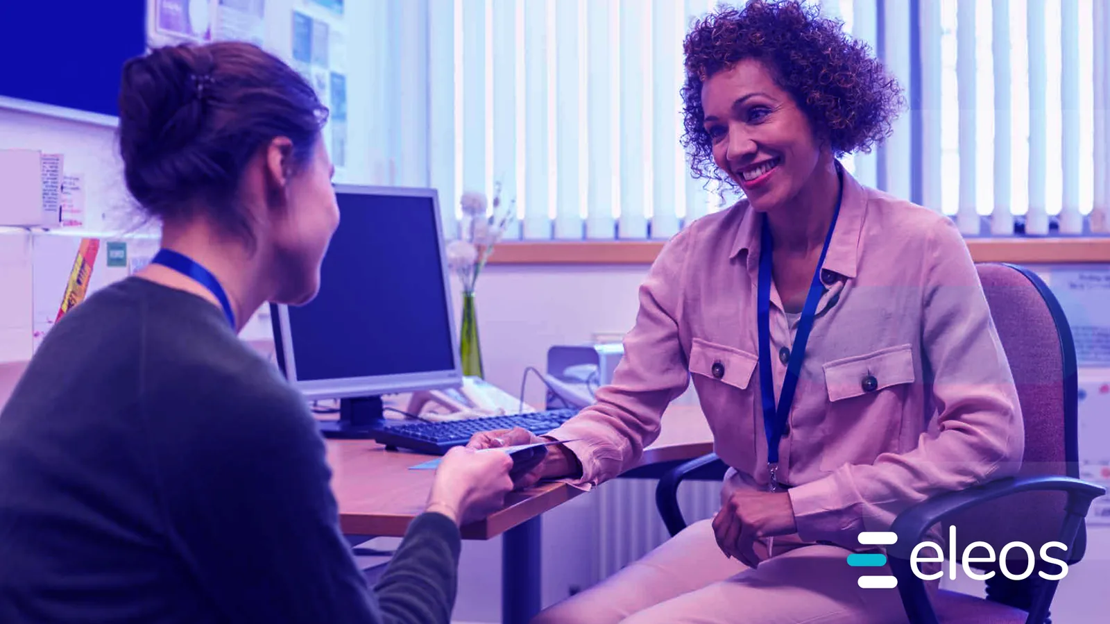
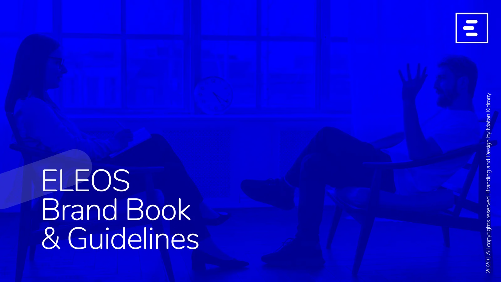
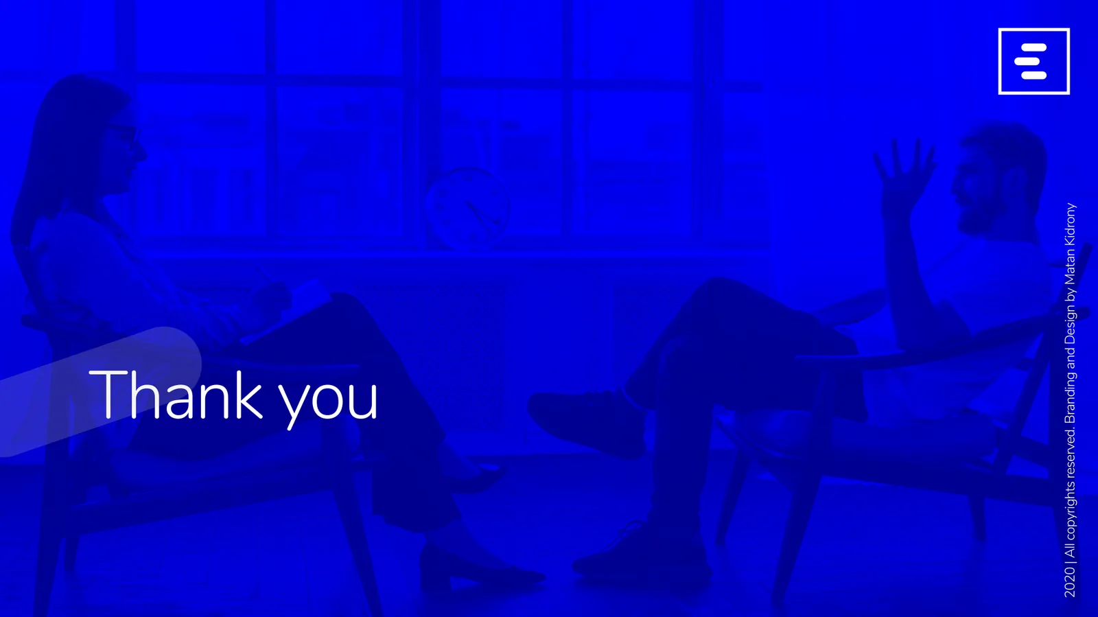
Real conversations, under a wash of blue.


Everything in one book.
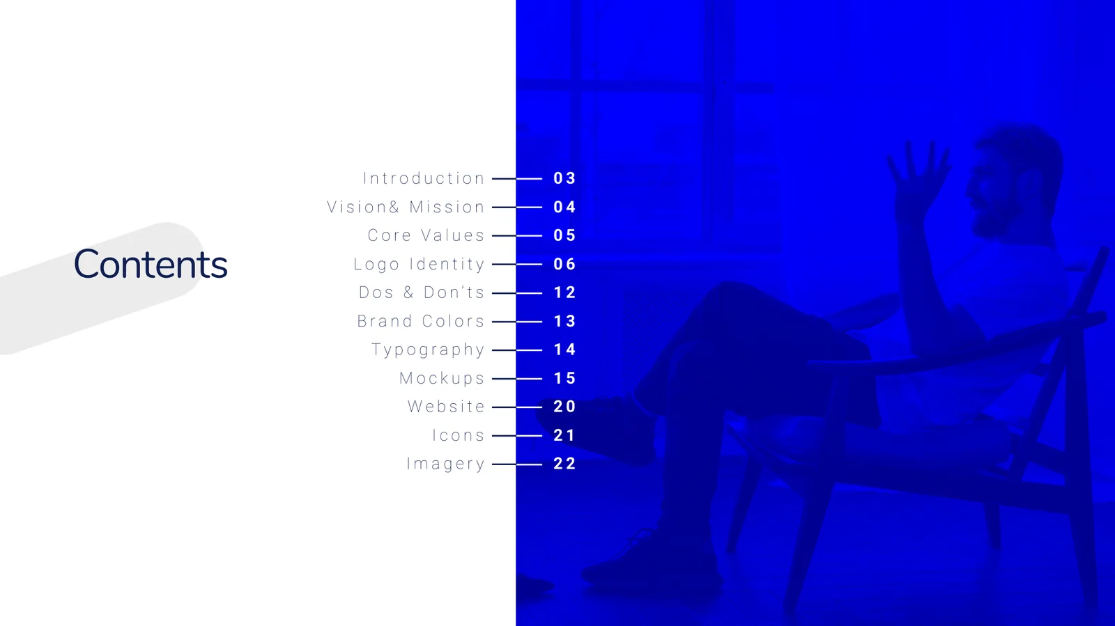
Twenty-four pages that take anyone creating Eleos communications from vision and logo to colour, type, mockups, website, icons and imagery.
 01 / 24
 02 / 24
 03 / 24
 04 / 24
 05 / 24
 06 / 24
 07 / 24
 08 / 24
 09 / 24
 10 / 24
 11 / 2412 / 24
 13 / 24
 14 / 2415 / 2416 / 2417 / 2418 / 2419 / 24
 20 / 2421 / 2422 / 2423 / 24
 24 / 24
Flip through all 24 pages. Click a page to enlarge it.
A big thank you to the awesome team at Eleos, who gave me the creative freedom and the delight to take this journey with them and walk them through the creative process, toward their business growth and success.