Every memory deserves a cover.
A full rebrand for Picabook, the service that turns the photos on your phone into printed albums, calendars and wall art. New identity, website, illustrations, packaging and print.
Click the album to open it
Printed memories need a brand you want to hold.
Picabook lets anyone pick photos from their phone or computer, design an album in a few minutes, and get it printed and delivered home.
I was asked for a full rebrand: a new identity, a website, and a family of printed pieces, from business cards and envelopes to product packaging. The brand had to feel warm and personal, read just as well in Hebrew and in Latin, and look good on a phone screen and on the cover of a real book.
The moment you lift the cover.
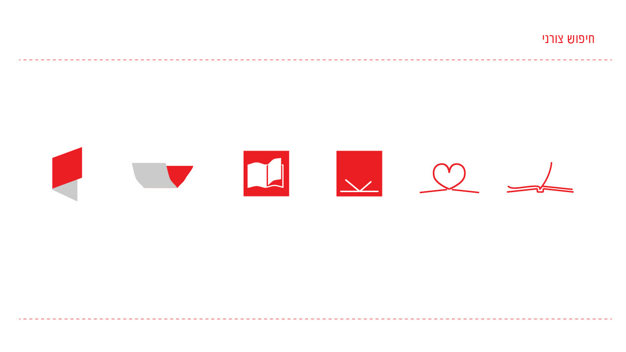
Every Picabook product begins with one gesture: opening the album. The symbol is exactly that, a red cover lifting off a gray page with a heart inside. It came out of a shape exploration of tabs, folded corners, open books and hand-drawn hearts.


Soft, round and bilingual.
A rounded sans that works in Hebrew and in Latin keeps the brand friendly in both languages. The palette is a single confident red, used sparingly, on charcoal and soft gray: the colors of a printed page.
Type · Latin + Hebrew
Set here in Varela Round, a close relative of the brand's rounded typeface.
Color · click to copy
Mostly white page, a little red. The red always points at what matters.
The cover opens.
In motion, the mark does what it promises: the red cover lifts, the heart appears, and the wordmark follows.
A small world of red details.
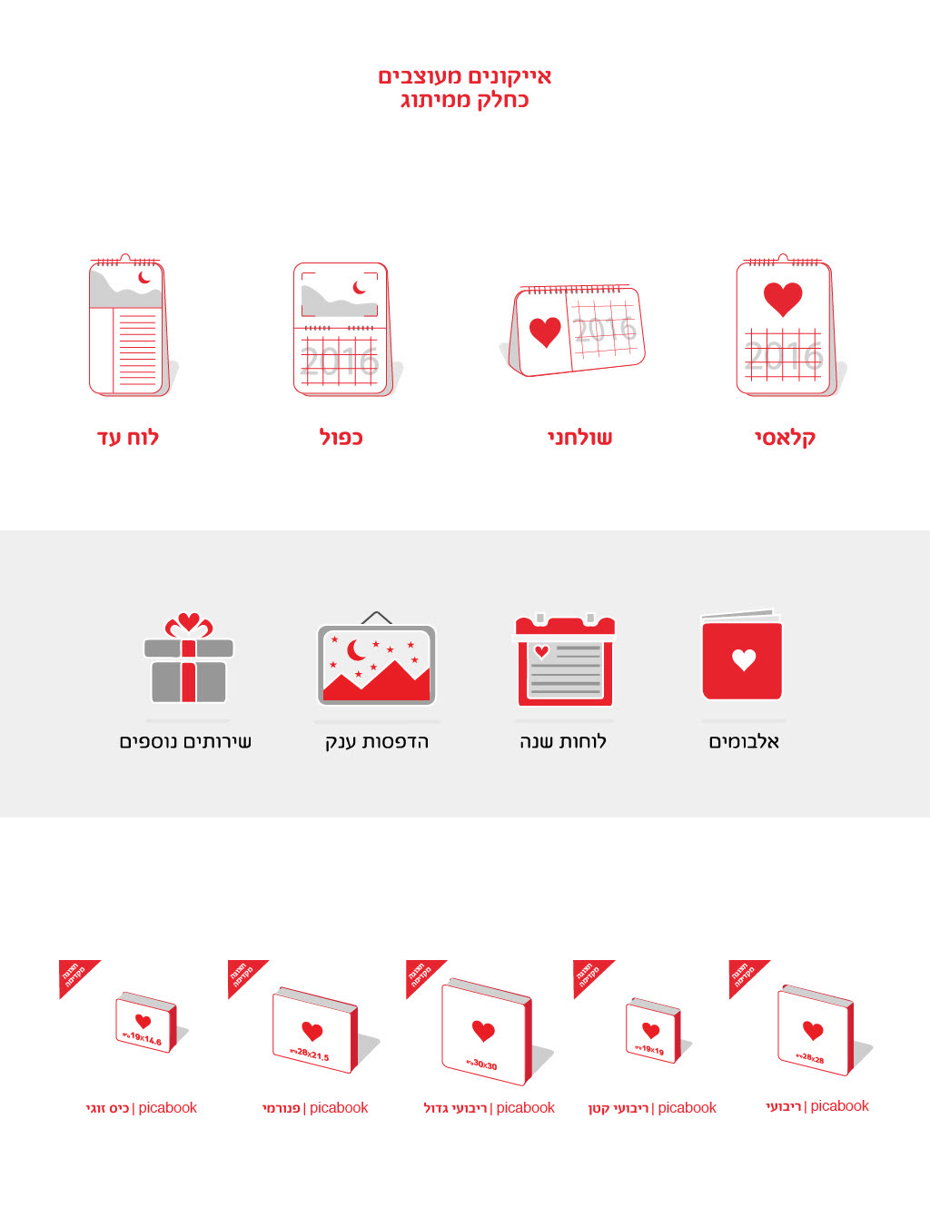
A custom set of product icons and spot illustrations explains the service at a glance. Everything is drawn in gray line and fill, and the red heart shows up exactly once per drawing.
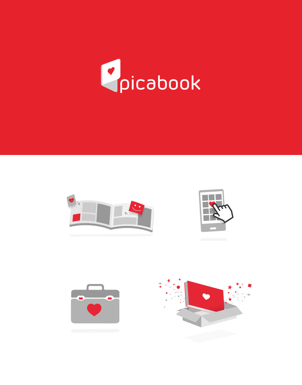
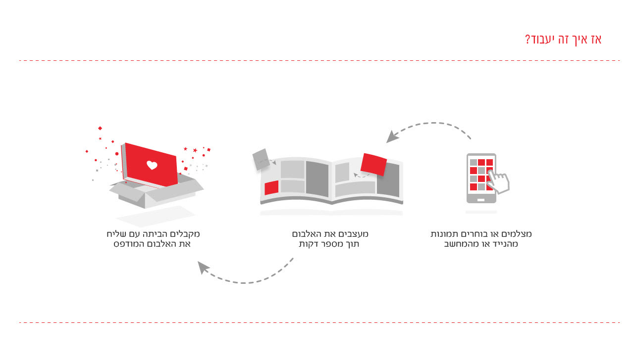
- Pick your photosFrom your phone, tablet or computer.
- Design the albumIn a few minutes, with ready layouts.
- It arrives homePrinted, bound and boxed.
From the first card to the box at your door.
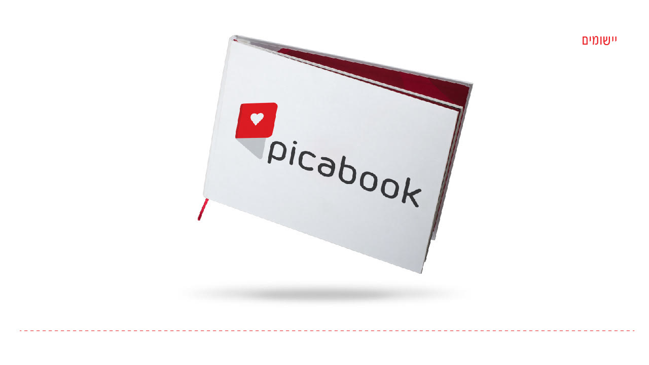
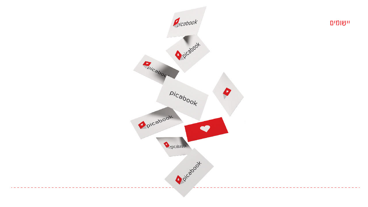
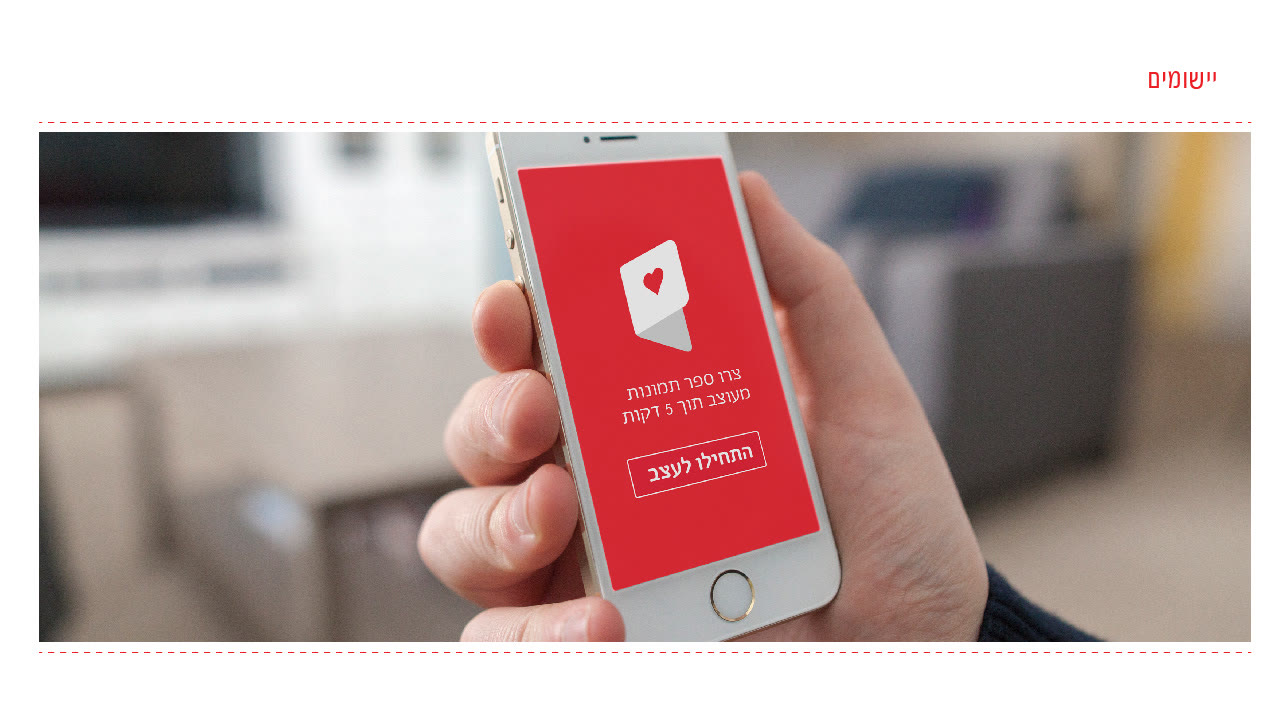
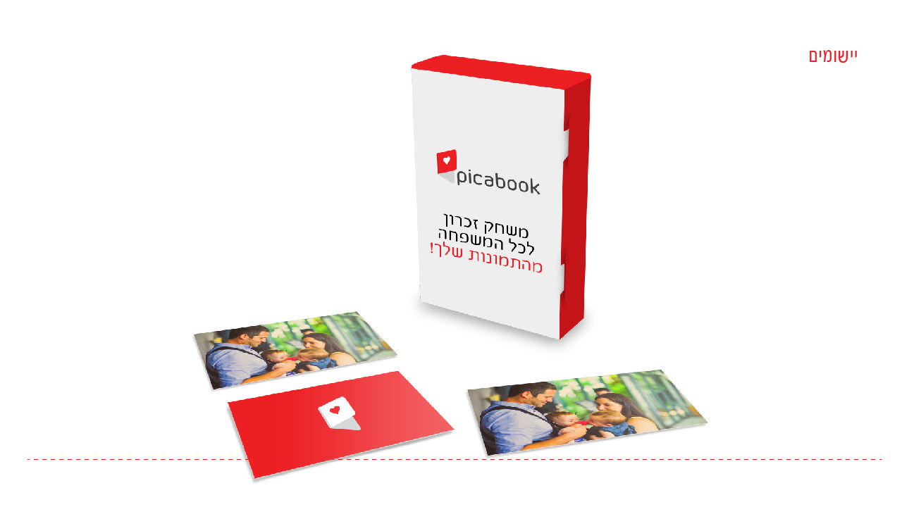
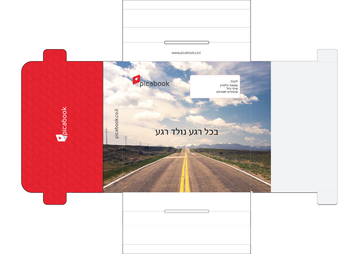
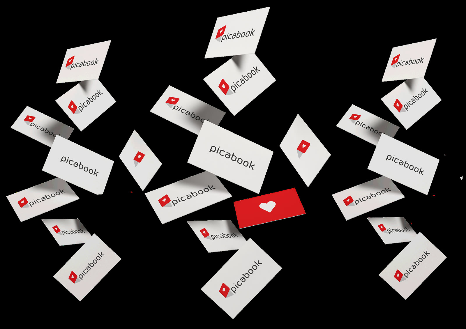
The identity runs through every physical piece: the album itself, business cards, the delivery envelope, packaging for a family memory game, and the mobile app.
A store that feels like flipping an album.
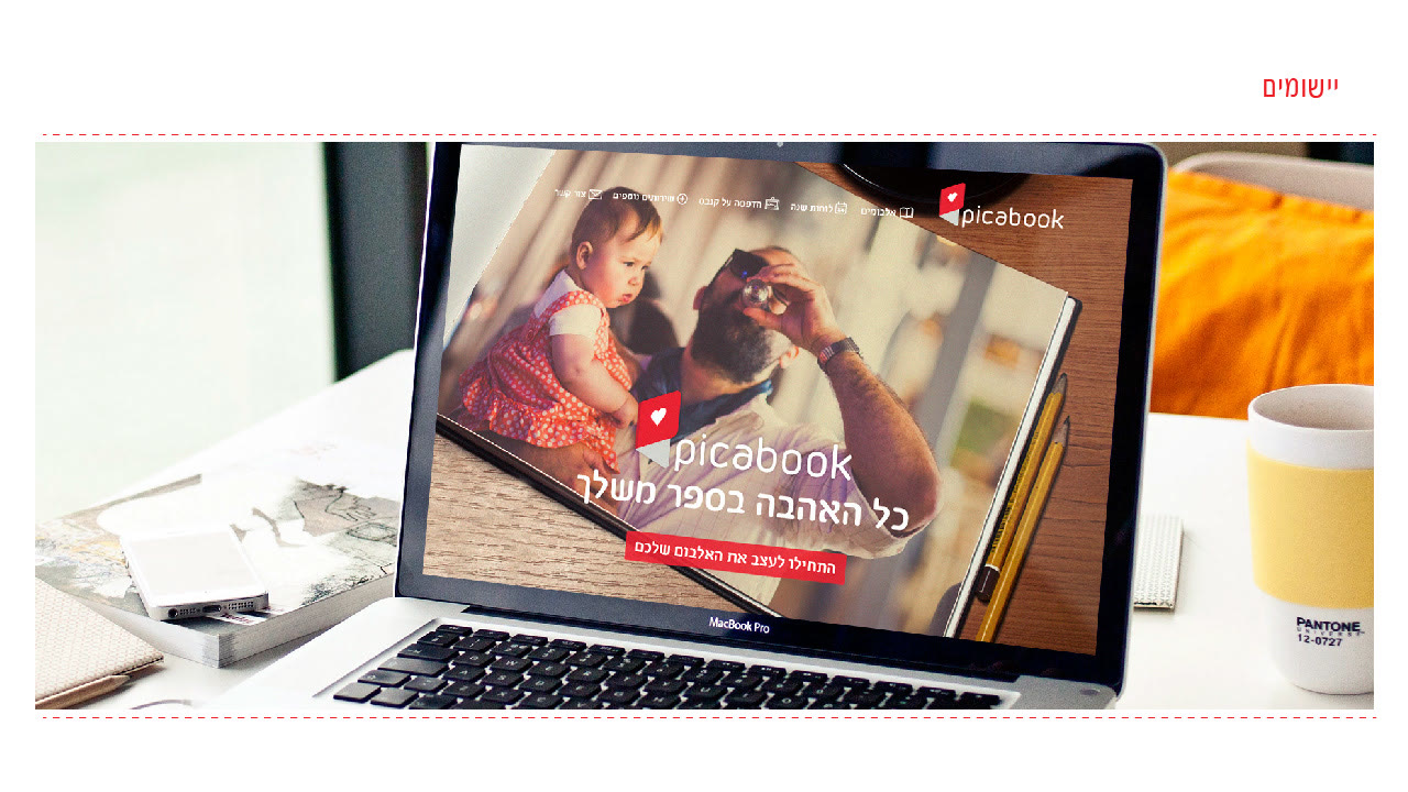
The website puts real family photos first, uses the red only for products and calls to action, and keeps every path to "create an album" one click away.
A brand you can hold in your hands.
One gesture, opening the cover, became a symbol, a motion, an illustration language and a family of printed pieces. It works on a phone screen and on the spine of a real album, in Hebrew and in Latin.