A voice AI brand built on empathy.
A full rebrand for Voca.ai, whose AI voice agents hold natural conversations with customers: identity, logo and symbol, illustrations, website, marketing and motion.
Happier customers, at scale.
Voca helps companies deliver happier customers at scale through natural, intelligent and empathetic phone conversations, handled by AI-powered, EQ-enabled Voca Agents.
Their vision is a win-win between humans and AI: agents take the routine calls, so human teams are free to do their most creative work. Voca invited me to rebrand the company from the ground up, from colors and logo to the look and feel, website, custom illustrations and marketing materials.
Together with Grant from the Voca team, we started with the brand story: the core essence, the message, what Voca offers and who it speaks to. Every visual decision came from there.
A waveform shaped like a heart.
Once the logo was set, I created a symbol that says what makes Voca different. The bars are a voice waveform. Their ends trace a heart. Voice plus empathy, in one shape.

Calm blues with a human warmth.
Blue for trust, cyan for the voice, navy for weight and a sky-blue background for air. Headlines use a clean geometric sans, so the friendly illustrations can carry the personality.
Headline type
Happier customers at scale with friendly voice AI agents
Color · click to copy
Giving the AI a face, without pretending it's human.
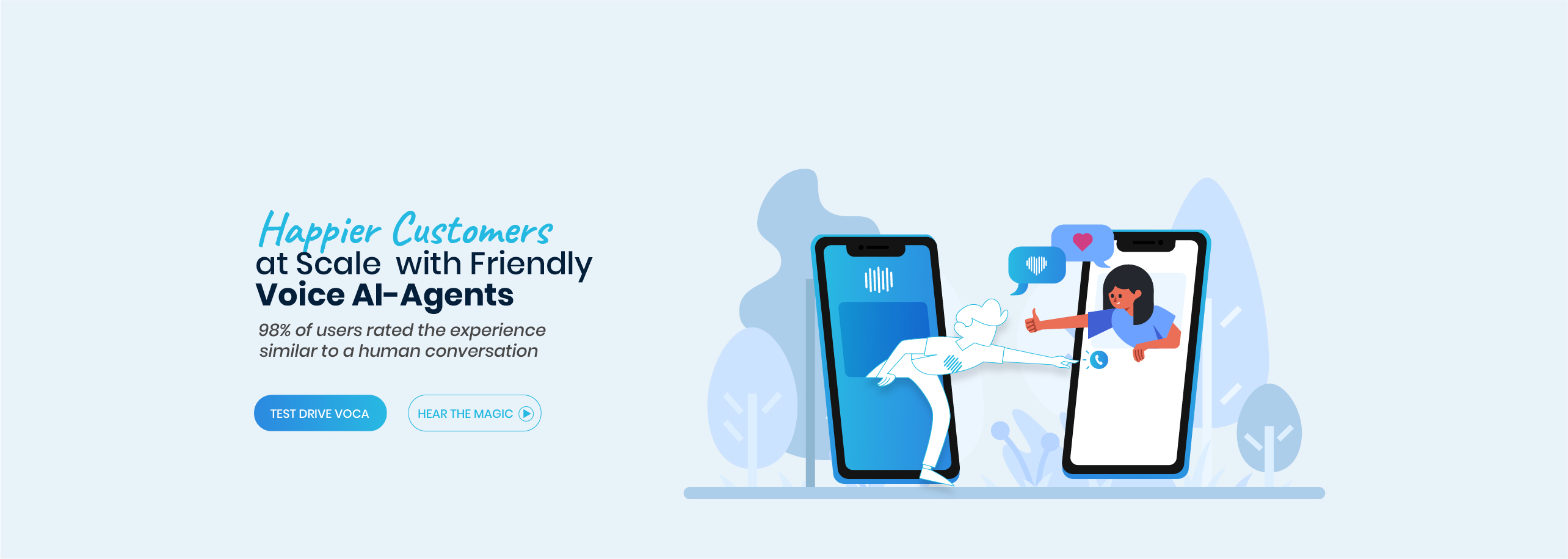
The Voca Agent is the brand's main character. He is drawn only in outline, with the waveform on his chest, while the customers around him are full-color people. He's friendly and present, but you always know who the AI is.


- Outline onlyWhite body and cyan line: the agent is clearly not a person.
- Waveform on the chestThe symbol becomes his badge.
- Humans in full colorReal people get the warm, filled treatment.
A custom world, one scene at a time.
I drew a full set of custom illustrations for the website and marketing, all in one style: flat shapes, soft blue backgrounds, the outlined agent and expressive people. Even the 404 page is on brand.



Where the whole brand comes together.
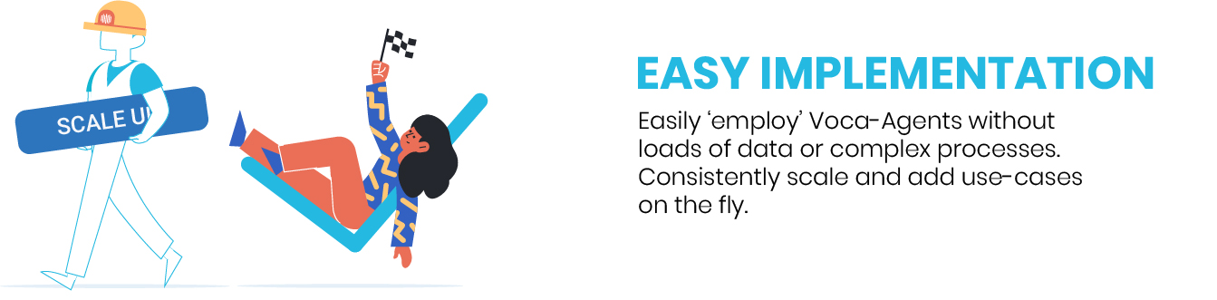
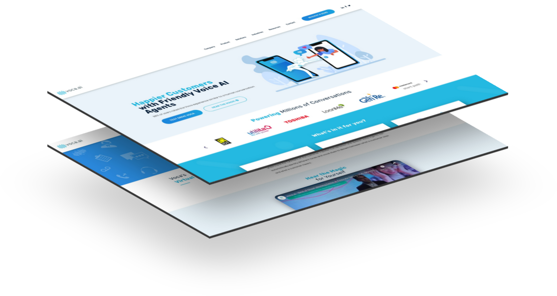
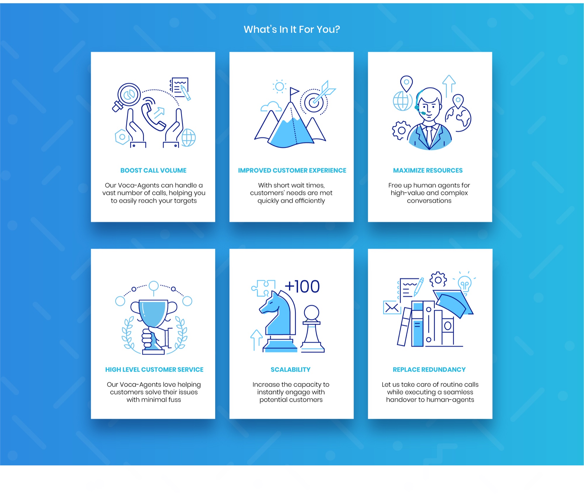
I designed the Voca.ai website end to end: the hero illustration, customer logos, a "Hear the magic" demo, and a benefits section with its own line-icon set.
Campaigns in the same voice.
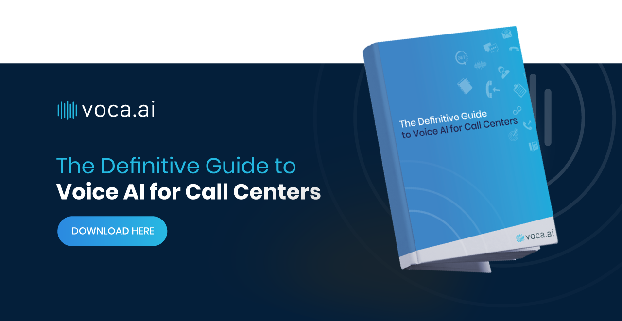
Ads, e-book covers and social banners reuse the same characters, colors and waveform, so every campaign feels like Voca at a glance.