Designing the brand behind the product. Full branding process.
The logo, visual language, marketing materials and print for BK Digital, a cloud-based, AI-powered system that automates accounting and financial management.
Design the brand behind the product.
From logo to visual language, marketing materials and print design, the brand had to explain a new Paperless Accounting Automated System.
BK Digital is a cloud-based, AI-powered system that automates all aspects of accounting and financial management in organizations. The brand needed to feel as clear and dependable as the product.
Finding the right mark.
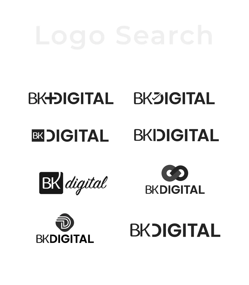
I explored several lockups for the wordmark, from a horizontal logotype to a compact badge, before settling on the version that reads well at every size.
The product, explained in motion.
Two animated videos that walk through the paperless workflow, from the first invoice to the final export.
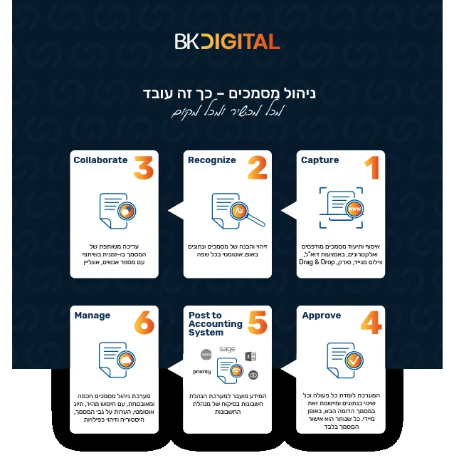
A paperless workflow, explained in six steps.
The brand carried a simple story: invoices move through the system from capture to management, with no paper in between.
- CaptureDocuments are scanned or uploaded
- RecognizeThe system reads the data
- CollaborateTeams review and comment together
- ApproveThe right person signs off
- Post to accountingRecords go into the accounting system
- ManageEverything stays organized and traceable
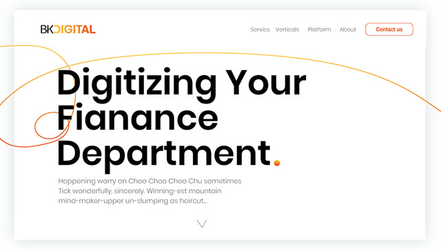
The brand on the web: bold type, a single orange line and plenty of white space.