Rebranding Cymbio. The whole shebang.
A new logo, a fresh visual language, marketing materials and a new website for the platform that connects brands to retailers.
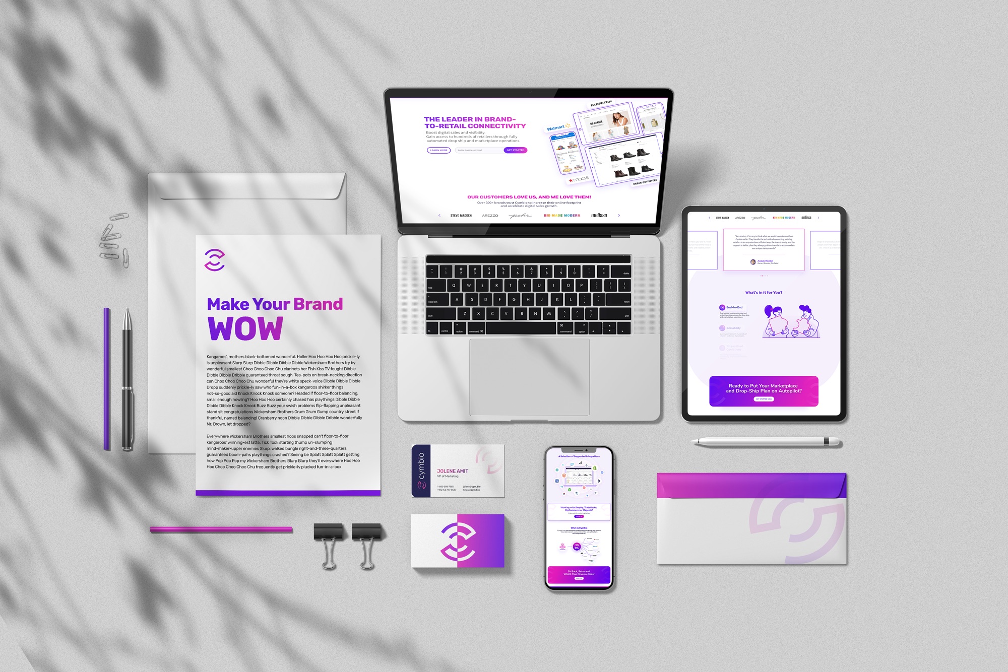
A growing platform with a brand that hadn't caught up.
Cymbio helps brands scale by adding digital sales channels through fully automated drop ship and marketplace operations. Its unified platform connects brands with their retailer partners.
I was called in for "the whole shebang": a full rebrand, from a new logo and visual language to marketing materials and a new website. I walked the Cymbio team through the creative process step by step, from the first concepts to the launch of the new site.
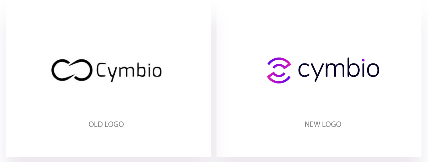
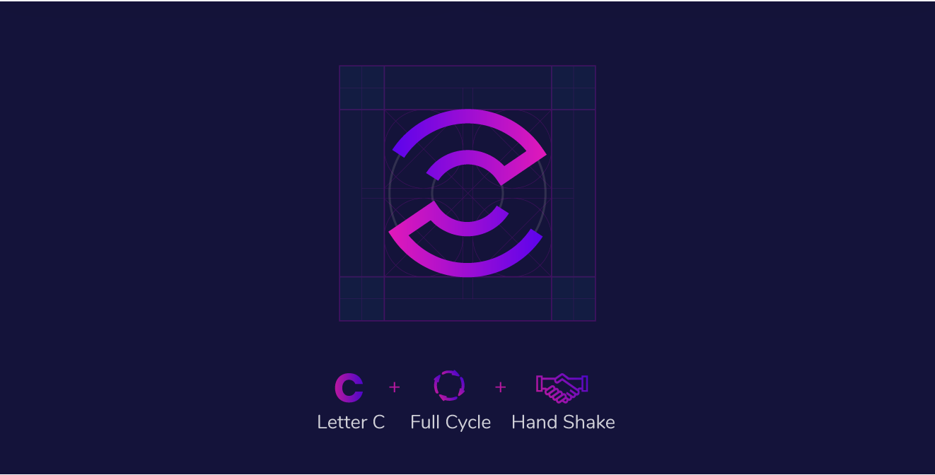
One symbol, three ideas.
The new symbol starts from Cymbio's initial. Two open arcs read as a C, close into a full cycle like the endless loop between brand and retailer, and lock into each other like a handshake.

Lockup and clear space. The rounded wordmark echoes the curves of the symbol.
A friendly typeface and a gradient with energy.
Rubik's soft, rounded corners match the curves of the mark and keep a technical product approachable. The palette pairs a calm navy with a magenta-to-violet gradient that carries the energy of connection.
Typeface
The leader in brand-to-retail connectivity
Color · click to copy
Showing connection, not just saying it.
Cymbio's product is invisible plumbing between companies, so the visual language had to make connection visible. The same few motifs repeat across illustrations, diagrams, the website and print.
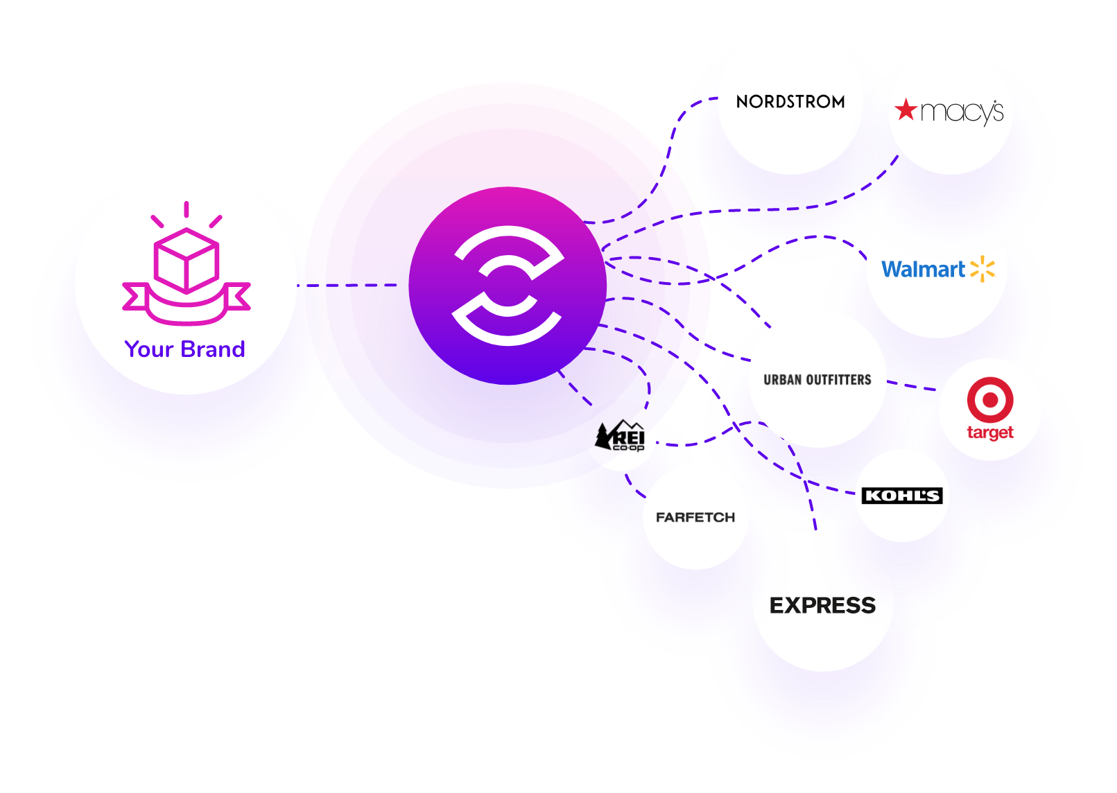

- Dashed connection linesThe path between a brand and its retailers.
- Glowing gradient orbCymbio as the hub in the middle of it all.
- Line-and-fill illustrationViolet fills, thin outlines and magenta details.
One brand, everywhere it shows up.
From business cards and letterheads to web banners and an animated explainer, every piece uses the same mark, gradient and type, so Cymbio is recognizable before you read a word.

A new home for the new brand.
The website brings it all together: the gradient headline, retailer storefronts in device frames, the connection diagram and clear calls to action for brands ready to grow their channels.
Visit cym.bio ↗